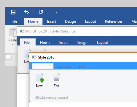
This started out as a project to apply themes to the Ribbonbar, and digressed into trying to get the ribbonbar to look like MS Word 2016. I had never used the ribbonbar before so I was not familiar with it.
I went back and just looked at the stock FW ribbonbar styles. I found that some of the other styles are much better recreations of early Office styles, particularly the 2010 version. However, I found that the 2016 stock style is poor replication of the Office 2016 style. This added a lot of work fixing this outside of the class.

The top image is Word 2016, the middle image is my version of 2016, and the bottom one is the ribbonbar's stock version of 2016. The stock 2016's tabs are too short, the text color is unreadable, the colors are wrong, etc. It is a lot of work fixing these things outside the class.
So my thought now is that the stock ribbonbar class should be modified to replicate the image shown in the middle above. Then all we need to do outside the class, is to set the theme colors. I would also like to add a few new class data variables to the class to make setting the colors outside the class easier.
I know some of you are not wanting the class modified, so I am asking for thoughts on doing what I am suggesting. I will be glad to make these changes myself and submit them to Antonio for addition to the next FWH release.
I do not know who the author, or authors, were of the ribbonbar class, but they did a great job on it. This is probably the most complex piece of code I have worked on. Sometimes I thought my head was going to explode just trying to understand the complexity. Kudos to all for the hard work that went into this class.
Any thoughts?


